
Appearance
Navigation Bar
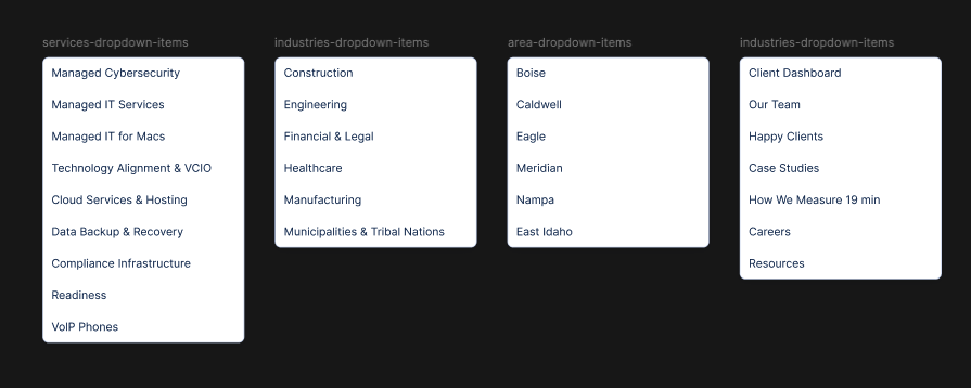
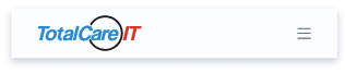
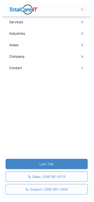
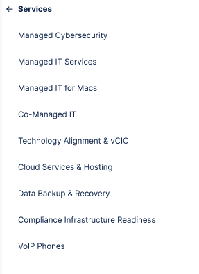
The site-wide header. The desktop layout shows the brand logo on the left, a horizontal list of dropdowns in the centre, and a primary call-to-action button on the right. The mobile layout collapses to a logo + hamburger that opens a full-screen menu with chevron-bearing nav rows; tapping a row reveals its dropdown items with a back button.

Fields
- Logo (from Global Settings)
- CTA Button
- CTA Button — "Let's Talk" in current designs
- Primary Nav Items (min 1, max 4)
- Label
- Kind (Link / Dropdown — Services / Dropdown — Industries / Dropdown — Locations / Dropdown — Company)
- Linked Collection (only when Kind is a Services / Industries / Locations dropdown) — Services / Industries / Locations
- Link (only when Kind = Link) — URL + isExternal?
- Company Items (only when Kind = Dropdown — Company) — labels + links (Press Releases, Resources, Case Studies — per Q8 these remain labels + links until a collection is defined)
- Label
- Link
- isExternal? (default: false)
Notes
- The "Areas" wording on the Locations dropdown is a copy label; the schema field is
Locations(per Q4). - Sales and Support phones render as outlined CTA Button link buttons in the trailing contact bar on mobile only (per Q29); the desktop nav lifts "Let's Talk" as the only CTA. The phones are not part of this slice's schema — they are read from Global Settings at render time.
Loading comments…