
Appearance
CTA Button
The standard call-to-action button used across the TotalCare IT site. Defined once here; every component whose field list links to CTA Button uses exactly this schema.
Variants shown in the brief
The eight screenshots cover two axes plus a default/hover state:
| Colour | Style | Default | On Hover |
|---|---|---|---|
| Blue | Primary (filled) | 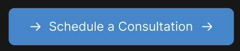 | 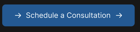 |
| Blue | Secondary (outlined) | 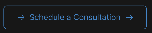 | 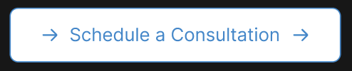 |
| Red | Primary (filled) |  | 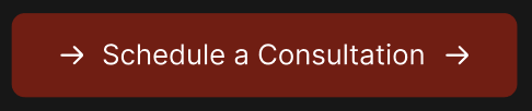 |
| Red | Secondary (outlined) | 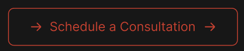 | 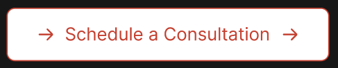 |
The trailing arrow is part of the button's look and is always drawn. The optional Icon field is purely additive — it renders an additional glyph either before or after the text but never replaces the arrow.
Fields
- Text
- Link
- isExternal? (default: false)
- Colour Family (Blue / Red) — hex value resolves to [CTA Blue] or [CTA Red] from Global Settings
- Style (Primary / Secondary)
- Icon (optional)
- Icon Position (Before text / After text) — only when Icon is set
Used in
- Hero Block
- CTA Banner
- FAQ Block — "Contact Us" button
- Navigation Bar — "Let's Talk" button
- Footer — phone-number link buttons (see Notes)
Loading comments…